


Colorful May

Hello dearest friends,
It's May (one of my favorite months) everything is getting green and cheerful so I thought it’s the right time to talk about colors.
I have just bought a couple of acryla gouache paints with an amazing friend and artist Judit Zengővári. It's nearly impossible to get Holbein products in Hungary so we ordered together, tested them, and found out that it's a miracle to paint with them. They are so pigmented and easy to apply so I would definitely recommend these products to anyone who likes to paint.


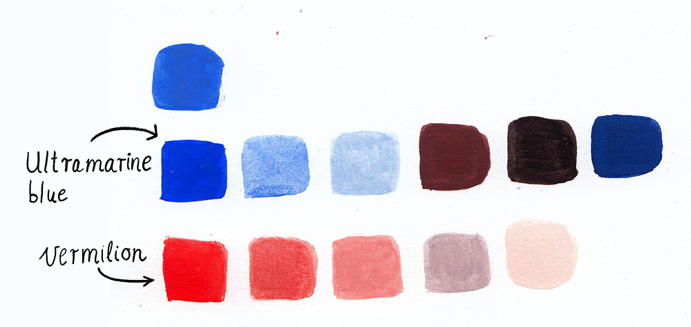
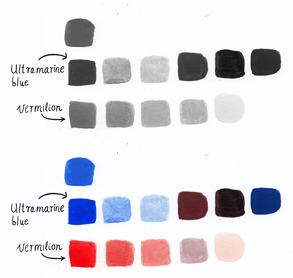
After I had some tests with my new paints I wanted to try out limited colors according to some color theory (which I never really followed before). I wanted to use colors from my new gouache paints so finally I decided only on 2 colors: vermilion red and ultramarine blue (blue was not from Holbein but I thought this ultramarine tone fits so much the sketch I've chosen)
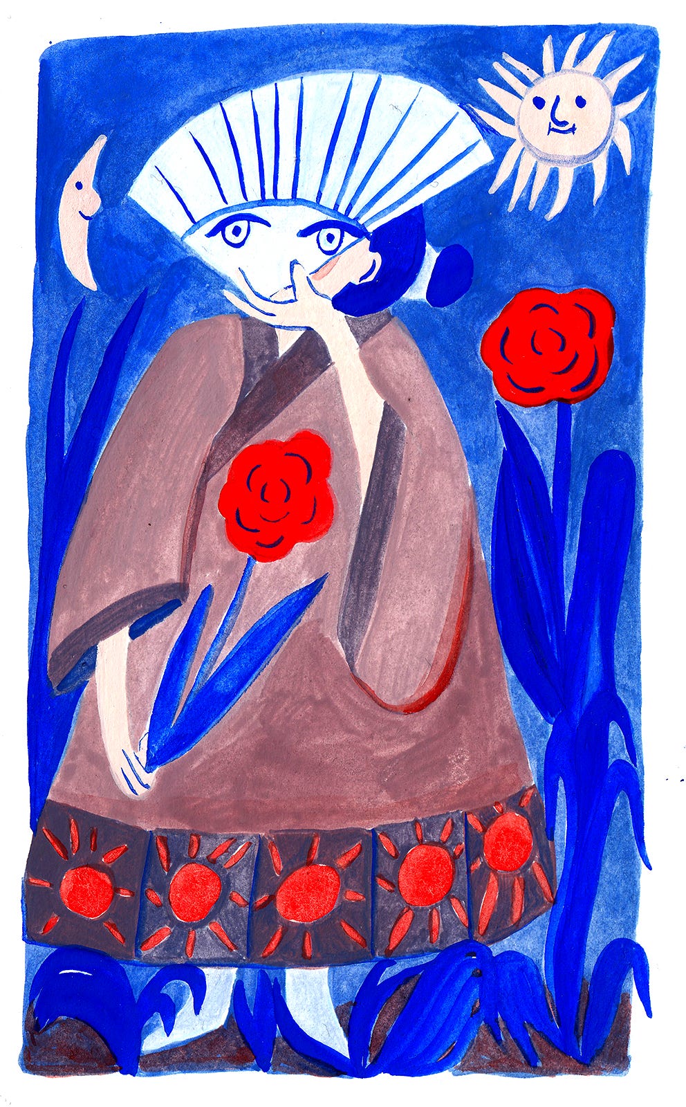
This is my drawing from a sketchbook, I used my lightbox to create the exact copy of the drawing.


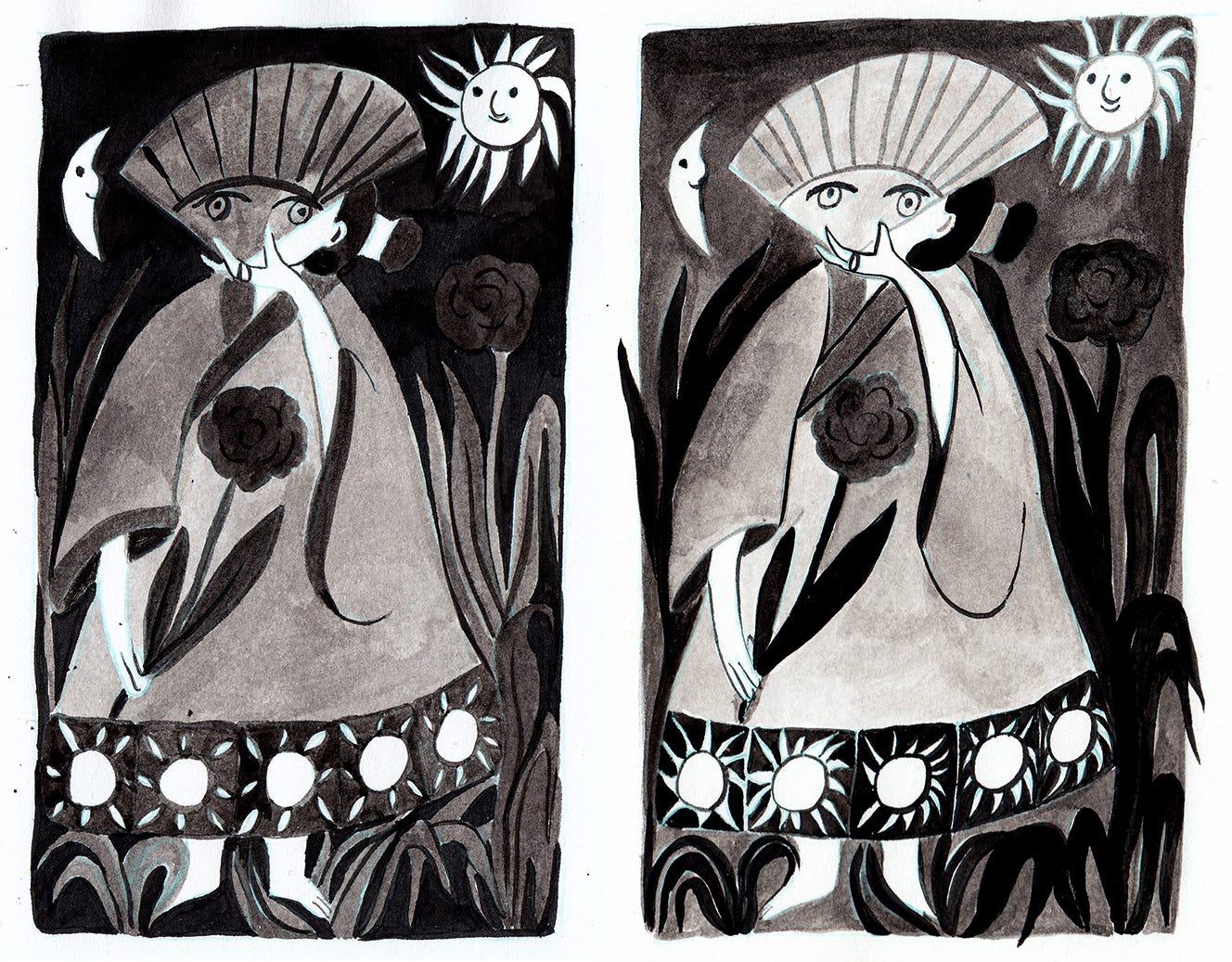
First of all I wanted to see the contrast of the drawings thus I thought it's a good idea to create a black-and-white sketch with ink. This way I could focus on only the highlights and shadows and didn't have to think about colors yet. I made
2 versions and finally decided to continue with the second one. I didn't want to have a really dark sky but instead add a feeling that you don't know whether you see a night or daytime scene.
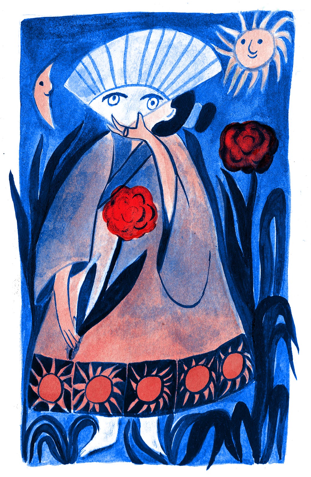
Next step was the actual painting part with the swatches I made before . First I had to choose some colors from the palette I created earlier.
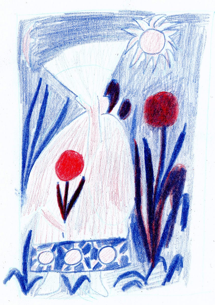
I made a little pencil sketch about how I would approximately mix the colors.
I knew I will need a tone for the skin, red for the roses and I decided to make the leaves of the flowers blue as well. This way the ultramarine blue will be able to dominate which I really wanted to achieve as a main impression about the illustration. I made a grayscale test on the colors so I could see what is the value of the greys. With this result I could control the contrast parameters of the colorized version.
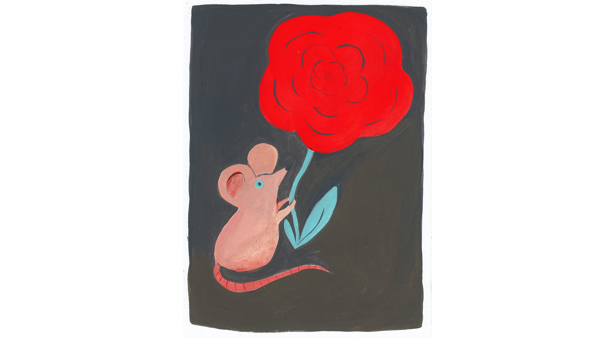
Voilá! This is how the painting turned out. The contrast is not as varied as the black-and-white ink version because I choose not to use the dark colors so they can be seen mostly as midtone blue and I don’t have to mix my ultramarine tone.
Lastly, I made an interesting experiment with coloring which is coming from the idea of screenprinting. I choose red and blue as my main colors so I made seperately a red and a blue layer.
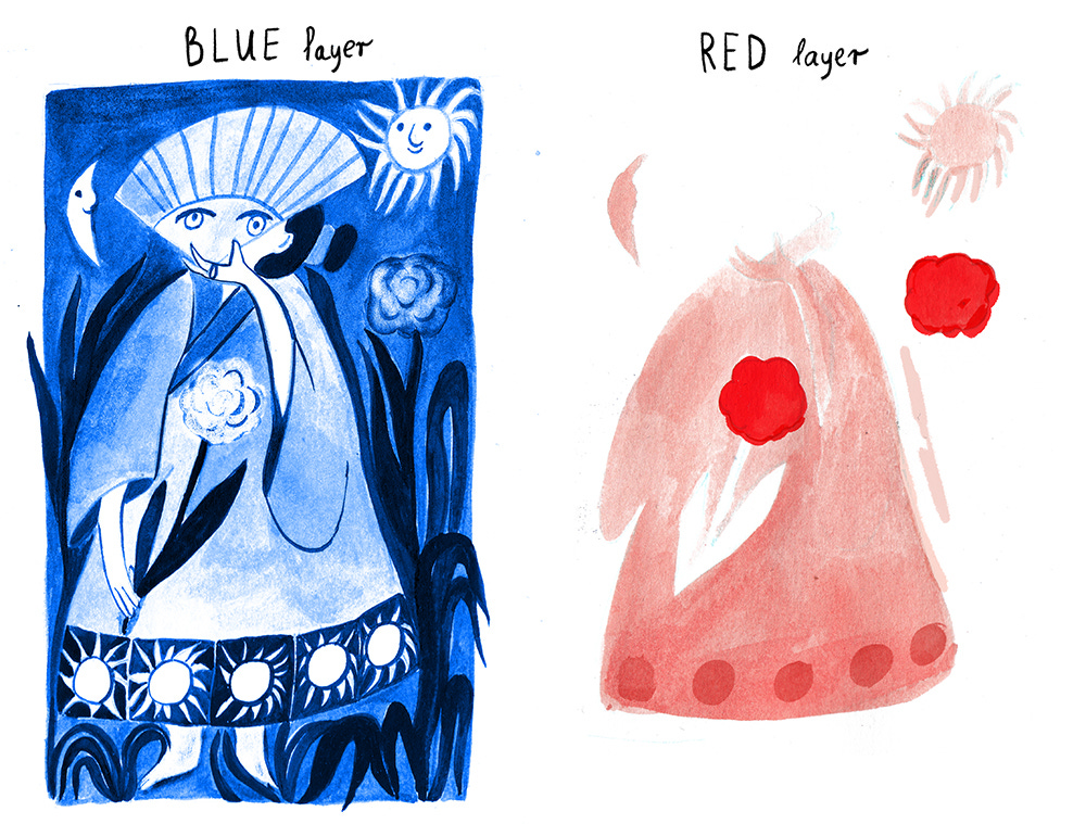
And this is the result of putting together them digitally in Photoshop as it was created as a screen print in real life.
Usually, I chose colors in a very subconscious way but this time I wanted to try some manual techniques that could work in a big project as well. I hope you liked it. Let me know which method you prefer or already tried out! I’m always happy to hear your opinions!
Sending Love
Ágnes
Some words about me
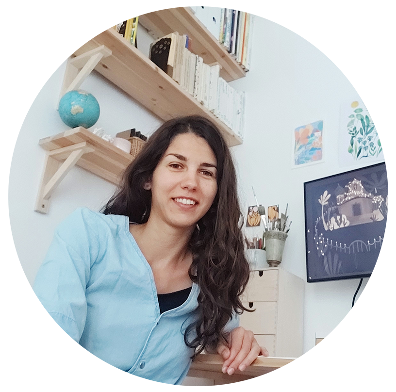
Hi, I’m Ágnes, a passionate illustrator and animated filmmaker from Hungary.
I'm obsessed with colorful drawings, funny characters, and nature-inspired illustrations. My work fields include editorial illustration, children’s book illustration, brand illustration, animated film, and gifs. Besides commissions, I teach animation and illustration at an art school in Budapest.